The service I’m working on is growing. With that, content can get messy. Last minute additions and changes before pushing live. New screens added, new lines of content. It can be difficult to keep track of key messages, content quality, and consistency.
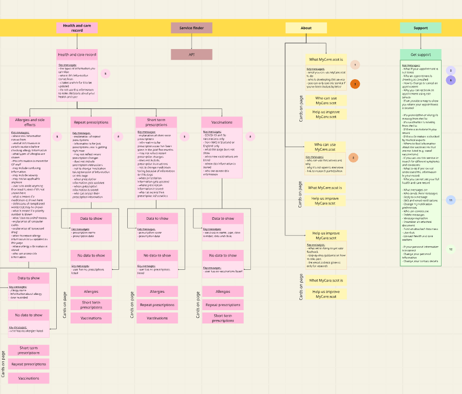
To combat this, I developed a site tree map that:
- shows the structure of content across the service
- highlights key messaging
- compares volume of content per screen
How I did this
I created the map on Miro to show the full digital service journey. I colour coded the design to reflect where linking happens across the service.
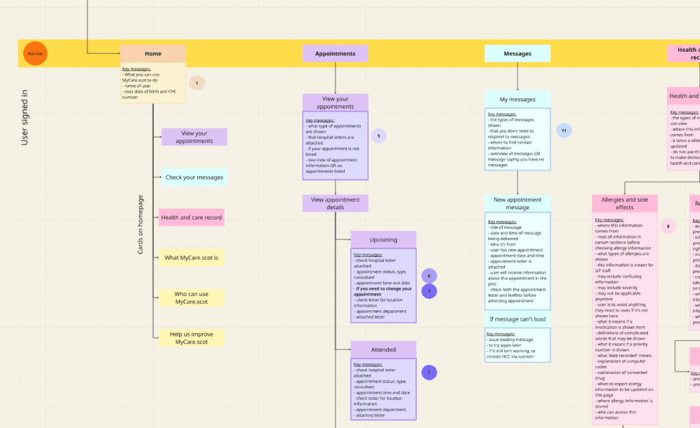
I developed a key to visually represent where messages were being repeated across the service.
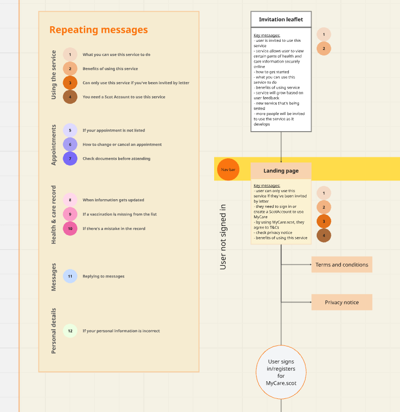
I listed the main messages for each screen, which highlighted how lengthy some screens were compared to others.
How this helped my colleagues
I presented this site tree map on a programme-wide call. This pulled the attention of our service designers, data analysts and service owners.
The service designers used this board to help flesh out their blueprints. The data analysts used this to map out how they’ll track their analytics. And the service owners used this to help prioritise the delivery roadmap for their particular work stream.
Next steps
I now need to work with user researchers to understand if users are receiving the right information at the right time. We can very likely reduce cognitive burden on some of these screens. Unfortunately, a lot of the messaging is due to clinical and technical limitations. In future, the content can be simplified once we improve the quality of data we pull through.
